When we look at responsive embedding we have to deal with how an element appears on a number of devices and multiple sizes. Lucky for us, most embeds take care of this for us, we just need to display them correctly and allow them to resize with our content.
You can prove it to yourself by resizing the window, but it looks like any other embed. We can accomplish this with just a bit of css and some javascript. The implementation below has both the code and the css.
How it Works
We are going to build a wrapper around every embed like so:
<div class="responsive-object">
  <iframe src="path/to/embed" />
</div>
This div will control the sizing of the underlying embed, so we want the embed to fill the entire space of the wrapper. We can accomplish this with a little bit of css.
.responsive-object iframe {
    position: absolute;
    top: 0;
    left: 0;
    width: 100%;
    height: 100%;
}
The wrapper is a little more confusing as far as css, but it looks like this:
.responsive-object {
  position: relative;
  padding-bottom: 67.5%;
  height: 0;
  margin: 10px 0;
  overflow: hidden;
}
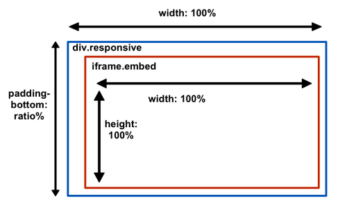
By default a div will fill the entire width of the container, what we have to worry about is the height. padding-bottom defines the ratio between the width of the div and to the height of the embed. Because of the positioning of the iframe, the embed will fill the width and the height defined by the padding. It’s a little counter intuitive, but here’s a handy little diagram:

We have set a default padding-bottom here, but in reality the ratio of the sizing of an embed changes per provider and even per embed. We need to calculate the padding-bottom and then add this as a style to the responsive wrapper. We can do this with just a little bit of javascript:
var ratio = ((obj.height/obj.width)*100).toPrecision(4) + '%';
To put this all together, here is the code to convert links into responsive embeds.
$('a').embedly({
  display: function(obj){
    // Overwrite the default display.
    if (obj.type === 'video' || obj.type === 'rich'){
      // Figure out the percent ratio for the padding. This is (height/width) * 100
      var ratio = ((obj.height/obj.width)*100).toPrecision(4) + '%'

      // Wrap the embed in a responsive object div. See the CSS here!
      var div = $('<div class="responsive-object">').css({
        paddingBottom: ratio
      });

      // Add the embed to the div.
      div.html(obj.html);

      // Replace the element with the div.
      $(this).replaceWith(div);
    }
  }
});
There you have it, responsive embeds in 20 lines of code and a bit of css.
